Saturday, January 14, 2017

The Status and Implications of United States Debt


United States Sovereign Debt

The Status and Implications of United States Government Debt

January 14, 2017

Brad Bradshaw
President, Velerity
brad@velerity.com

A.          United States Sovereign Debt Is Approaching $20 Trillion

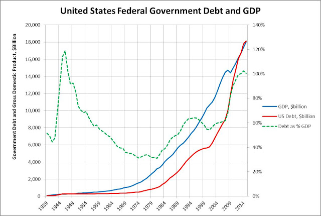
United States government debt is approaching $20 trillion and more than doubled between 2005 and 2015, rising from $7.8 trillion in 2005 to $18.1 trillion in 2015.  This rate of growth in our national debt is a concern.  Is the United States becoming too indebted as a nation?   Will the burden of our national debt subsume our economic vitality and future well-being?  Is our government at risk of defaulting on its national debt?      

For nearly one-hundred years, as shown in Figure 1 below, our national debt has moved roughly in lock step with GDP, albeit with a few exceptions.  First, as seen in 1944, the government issued significant debt as part of the war effort, with our national debt rising to about 120% of annual GDP.  From 1944 to the mid-seventies, national debt remained in a relatively slow growth regime.  Starting in the early 1980’s, however, debt as a proportion of GDP began to rise, going from about 30% of GDP in 1982 to about 65% of GDP in 1995.  In the 1990’s, government debt hit a relatively stable period, with reduced growth rates, until 2002, at which time we see another uptick in the growth of debt, accelerating for about a decade.   


Figure 1 – United States Sovereign Debt

The 2007 recession created an extraordinary economic challenge, with fears of total collapse of the global economy.  Accordingly, the United States federal government, peering down into an economic abyss, decided to significantly increase liquidity in the market, through several means.  Regardless of the specific mechanisms, the U.S. treasury loaded up on a significant amount of debt, increasing the federal debt 79% over a 5 year period from 2007 to 2013, with the national debt increasing from $9.0 trillion at the end of 2007 to $16.1 trillion by the end of 2012.  This acceleration in the growth and stratospheric level of our federal debt is concerning. 

B.          Our Growing Federal Debt has Placed the United States in Perhaps an Unwelcome Pantheon of Debtor Nations

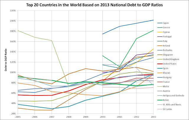
Figure 2 below provides some comparative context for the United States’ level of debt.  Based on 2013 data from the World Bank, the United States is 10th in the world when compared to all other countries in terms of its level of sovereign debt compared to GDP.  The unwelcome pantheon of debtor nations includes Greece, Portugal, Ireland and Spain, countries which have faced significant challenges due to their debt being downgraded, and their capacity to sustain borrowing being limited.  These countries were forced to significantly curtail government expenditures, further extending and deepening economic downturns and creating social chaos.  Greece’s ongoing economic, social and political strife provides an example of how poorly handled (exploding) sovereign debt can impact a country and its people.   

Figure 2 – Comparison of Debt to GDP for Selected Countries   

The United States is also in the company of several large, established economies, including United Kingdom, Italy, France and Austria, with equally large and dangerous levels of sovereign debt.  This begs the question as to whether or not this level of debt for the United States is sustainable, much less prudent and warranted. 

C.           Low Interest Rates Are Keeping Debt Servicing Costs Low, Will This Advantage Last?

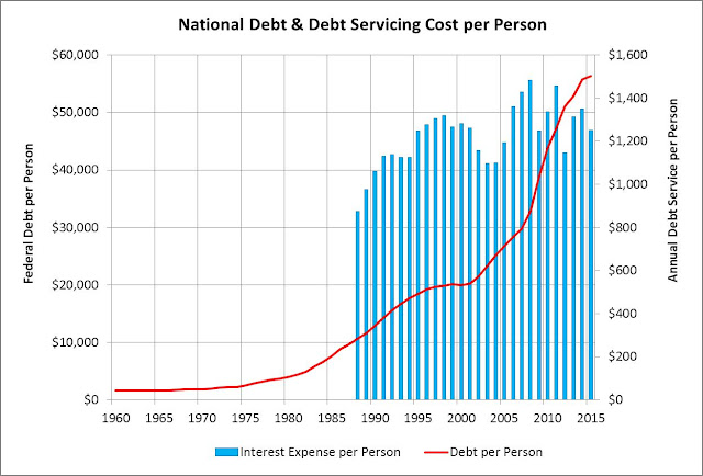
To bring the impact of our national debt down to a personal level, the amount of indebtedness per person has risen from about $20,000 per person in 2000 to $55,000 per person in 2015, nearly tripling over 15 years.  The cost of this indebtedness per person, however, has benefitted tremendously from the on-going low levels of interest rates, with the interest expense per person keeping within a tight range in the past 25 years, ranging from about $1,100 per person per year to $1,400 per person per year, as seen in the blue bars in Figure 3 below.    

Figure 3 – National Debt Per Person and Debt Servicing Per Person

It is extremely unlikely that interest rates will remain this low going forward.  The implied interest rate associated with the United States’ debt servicing costs was a mere 2.23% in 2015, the lowest it has likely ever been, and the lowest level for that past thirty years of data evaluated for this analysis.  This has been an extraordinary gift for the citizens of the United States as well as the federal budget.  Unfortunately, we know it will not last.  We are currently entering a period of tightening, with the Federal Reserve Bank already increasing interest rates twice in the past twelve months, with further tightening expected in the next few years. 

D.          What Really Is the Impact of Federal Debt? 

Our federal debt is a function of the federal deficit, occurring when spending exceeds revenues.  The federal government continues the policy allowing spending to exceed revenues, and accordingly place the cost of running the government in the current year on backs of future tax payers.  Every taxpayer in the country has a future and ongoing financial obligation to pay for today’s government expenditures for many years into the future. 

There are classic risks associated with this policy of letting current deficits continue, placing future obligations on taxpayers, and letting the debt rise to beyond currently stratospheric levels.  The most significant is that interest rates will rise, and the financial burden on each taxpayer may well double within the next five years.  This financial obligation will crowd out other federal budget priorities, taking a progressively larger share of the federal budget.    

The debt obligation will also limit the ability of the federal government to address future economic downturns, limiting our ability to call upon fiscal and monetary policy.  There may be a point in time when the high level of debt and associated obligations negatively impact the government’s debt ratings and borrowing capacity. 

At a more fundamental level, however, federal debt is a shift in wealth from taxpayers to investors.  As a result of federal debt, taxpayers lose control over their own financial well-being, and have less disposable income to spend or invest. 

At the end of the day, the federal government is asking taxpayers to invest in government operations, with the implied promise that, from a social perspective, these investments will generate greater value for society going forward than the associated cost of those investments.  The unfortunate reality is that the government’s expenditures at the margin are not likely to generate greater value than the cost of those investments.  This places a drag on the economy, a parasitic burden from a value generating perspective. 

This investment drag on the economy is also additionally burdened by the reduction in the velocity of dollars in the economy caused by the inequity and imbalance associated with taking money out of the hands of taxpayers and placing it in the hands of bond investors. 

E.           Conclusion – Where does this Leave Us?

The big picture for the United States associated with this high level of debt is troubling.  If we face another economic downturn, we may not be able to overcome the economic challenge with limited access to fiscal or monetary tools.  We may be entering a new economic phase, similar to Japan, in the clutches of a struggling economy for decades, with no apparent solution. 

Historically, a growing economy coupled with an increase in inflation has been the approach to bring a country’s indebtedness in line with its economy.  The 1990’s was a time when our federal government was able to bring our expenditures in line with tax receipts.  It is going to be a fundamental imperative that we return to a period of reducing government expenditures and/or raise taxes to address this imbalance and step back from the debt precipice. 

Additionally, it would be useful for our federal government to make expenditure decisions that explicitly take into consideration the long term value creation or destruction associated with budget line items, to shift the mix of government expenditures, at the margin, to have a greater positive impact in terms of value creation and on our future well-being.

Our federal government should also implement tax and expenditure policies that encourage greater investments across our economy in value creating investments and activities, and away from parasitic and value destroying investments.  The absence of an explicit understanding and of having a policy of encouraging value creating investments will result in a long and unsatisfying economic malaise and economic hopelessness for the United States.  

Wednesday, January 11, 2017

US Economic Review


Assessment of the United States Economy

A Review and Assessment of the Current Strength of the United States Economy and of the Likelihood for an Economic Downturn Over the Next Five Years based on Evaluating Eleven Key Economic Performance Indices

January 2017

Brad Bradshaw
President, Velerity
brad@velerity.com

A.          Summary - The United States Economy is Strong and will Grow Briskly Through 2017 and Into 2018, At Which Time Growth will Begin to Falter

The United States economy is exhibiting a strength that is likely to continue through 2017 and into 2018, at which time, absent certain exogenous factors which can be difficult to predict and may accelerate constraints on growth, the economy will face increasing headwinds in keeping with the natural course of the business cycle. 

This assessment is based on evaluating the strength and trends of certain underlying factors which provide a picture of the health and direction of the economy.  There are, however, also certain other factors which are beginning to push back on the overall strength of the economy as well, factors which are limited in their impact at this time, but which will grow over the next two years. 

This summary is designed to bring to light these factors and for readers to draw their own conclusions. 

B.          Vehicle Miles Driven Continue Strong Growth Trajectory

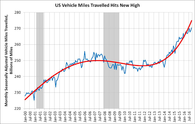
A strong indicator of economic activity is the total vehicles miles driven, derived from data published by the United States Department of Transportation, shown in Figure 1 below.  Vehicle miles driven currently surpass the pre-recession level of about 255 billion miles per month to the current level of about 270 billion miles.  The trajectory of miles driven shows a decline in the rate of growth just prior to the 2007 recession.  The current trajectory shows significant relative upward growth, with perhaps a little softening beginning in July 2015 and extending to the current period.  The grey bars in the chart below correspond to recessions.     

Figure 1 – Vehicle Miles Driven

Going forward, it will be useful to track this factor closely, to see if the rate of growth continues to decline as it perhaps has in the last twelve months of data.    

C.           Total Non-Farm Employment Continues Strong Upward Growth Trajectory

Employment in the United States is a strong indicator of economic activity, given that consumer expenditures make up approximately two-thirds of the country’s gross domestic product. Throughout history, the level of economic activity correlates very well with vehicle miles driven and, over many years, aggregate energy consumption.  Total non-farm employment, as seen in Figure 2 shown below, exceeds pre-recession levels, moving from approximately 138 million in 2007 just before the recession, dropping to approximately 130 million people just after the recession, and rising to close to 145 million people by the end of 2016.     

Figure 2 – Total Non-Farm Employment

The trajectory of total employment was strong as 2016 came to a close, with no market change in direction or even a hint of an inflection point.  It is important to note that as total employment continues to rise, and unemployment falls below the economy’s full employment level, it is likely that there will be increasing pressure on wages.  The feedback on the economy will potentially be moderate inflation pressures.

Total employment is an important leading indicator relative to assessing the forward going strength of the economy.  Before each recession, the trajectory of total employment falters, beginning with an inflection point, followed by a decline in growth rates, a decline in the pitch of the trajectory.  There may be a hint of an inflection point in recent data, giving the current expansion a minimum of one more year, and not less.

D.          Nominal Wages Continue Upward Growth Albeit Exhibiting Zero Inflation-Adjusted Growth Since the Recession

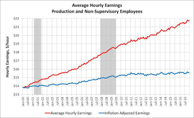
Wage growth in the United States has been tepid since the 2007 recession, growing at half the pre-recession level.  Figure 3 below shows continued and steady growth in nominal wages since 2000.  Wages do not appear to have much sensitivity to aggregate economic activity, which results in the observation that wage growth in not a strong indicator of economic activity. 

When adjusted for inflation, however, wages exhibit a longer term and troubling trend, with reduced growth post-recession as compared to the pre-recession period.  The annual growth rate of inflation adjusted wages prior to the recession, over the period from January 2000 through January 2008 is approximately a 0.87% compound annual growth rate.  From the period after the recession, from July, 2009 through July, 2016, the compound annual growth rate is only about 0.47%.  This low growth rate in wages since 2009 belies structural changes in the economy, with labor being crowded out by more efficient capital and equipment resources as factors of production, and the loss, for perhaps a range of reasons, of bargaining power of labor across the economy.   

Figure 3 – Average Hourly Earnings

Going forward, it will be instructive to observe the inflation adjusted the rate of growth in wages.  It appears that an inflation adjusted annual rate of growth above 0.5% to 0.7% likely indicates or is a pre-requisite for a run-up into an over-heated economic cycle.   

E.           Existing Home Sales

Existing home sales, as seen in Figure 4 below, continue upward growth, moving from about 4.75 million units in August, 2012 to approximately 5.6 million units in November, 2016, representing a compound annual growth rate of 3.9%. This level of growth is not sustainable in the long term, and would need to re-evaluated relative to the overall housing stock level. 

Figure 4 – Existing Home Sales

F.           Housing Starts

Housing starts are an important indication of the health of our economy, illustrating the capacity for existing and prospective homeowners to invest in their future, entailing commitments of capital and income that illustrates their own economic well-being and capacity.  In Figure 5 below, housing starts peaked two and one-half years before the 2007 recession, with permits being pulled for 200,000 units in June, 2005. 

Figure 5 – Housing Starts

The level of new home construction was destroyed by the 2007 recession, dropping 85% from the peak of 200,000 units in June, 2005 to approximately 30,000 units in January, 2009.  Since the depths of the recession, housing starts have recovered to approximately half of what they were at the peak. 

Housing starts have not fully recovered from the 2007 recession.  Housing starts appear to be a strong leading indicator of a recessionary economy.  The appetite of consumers to purchase new homes is subject to their income and interest rates.  Slowdowns in the economy begin with constrained personal incomes and rising interest rates, which is consistent with the validity of housing starts as a good indicator of the strength of the economy. 

There also appears to be a summer peak typically associated with housing starts.  This summer peak will be an important number to watch going forward, as a year over year drop in the summer peak provides an strong indication that a pull-back in the economy may be underway.  As it currently appears, there may be a slight downward shift in the year over year growth rate between 2015 and 2016 which bears close scrutiny going forward. 

G.          Primary Energy Consumption Trending Moderately Upward

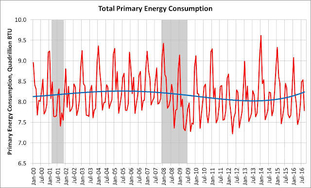
Primary energy consumption correlates very well with long run economic activity.  The consumption of energy is highly variable on a month to month basis, given the significant amount of energy used for heating, as evidenced by the January peak in each year.  We also see summer surges in energy consumption, usually driven by increased vehicle miles driven, and cooling energy loads.  None-the-less, in looking at smooth line in Figure 6 below, energy use peaked prior to the 2007 recession and has since rebounded. 

Figure 6 – Primary Energy Consumption

Going forward, this will be an important factor to track, to see if energy consumption flattens out or heads down. 

H.         Primary Energy Consumption Remains Below 2007 Peak

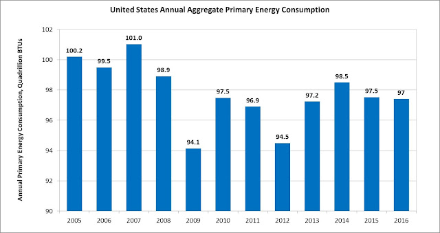
On an aggregate basis, total primary energy consumption in the United States has not reached the pre-recession level, as illustrated in Figure 7 below.  The rebound has occurred off the lows from 2009 through 2012.  It is not likely that we will see a pull-back in the economy until we see energy demand move up, creating upward pressure on production and pricing, creating an inflationary cycle.  This belies the importance of tracking energy costs going forward and their tie to inflation and associated tempering of economic activities associated with increasing interest rates and commodity prices. 

Figure 7 – Annual Primary Energy Consumption

I.             Oil Prices Slightly Rebounding Off Historic Lows

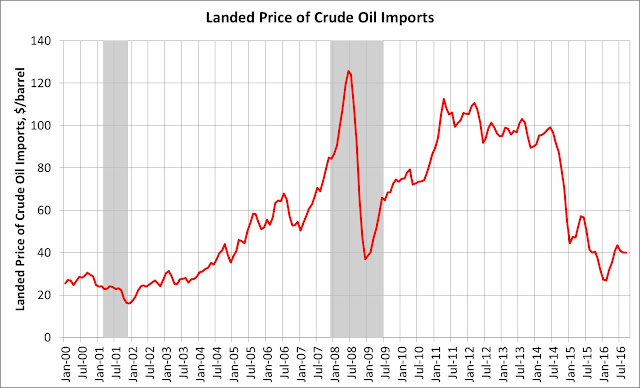
Oil Prices soared prior to and into the middle of the 2007 recession.  After peaking at over $120/barrel in July, 2008, oil prices collapsed, falling to less than $40/barrel within seven months, by January, 2009.  Since that time, oil prices rebounded sharply to over $100/barrel, for about three years, and then have settled back down to between $30 and $50 per barrel. 

Figure 8 – Landed Price of Oil Imports

Oil prices remain strongly tied to economic downturns, with rising oil prices implicated in five out of the last six recessions.  The quick recovery of oil prices in the period from January, 2009 to March, 2011 is truly remarkable, and would, based on prior patterns, presaged another economic downturn.  As it was, however, the $100 per barrel oil price was not sustainable, and we have since seen a drop to a range between $30 and $50 per barrel.   

Low oil prices are a boon to the economy.  We will likely not see an economic downturn until such time that the demand for energy increases, and oil prices move up.  The current relatively low level of energy prices presages a period of stable economic activity.

J.             Natural Gas Prices

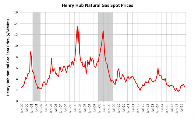
Natural gas prices have exhibited price patterns similar to oil, rising to over $12/MMBtu by July, 2008 in the early stages of the recession.  Natural gas prices have since trended much lower, currently trading around $3/MMBtu. 

Figure 9 – Henry Hub Natural Gas Spot Prices

Low oil and natural gas prices have been a significant benefit to the economy.  These low prices have been due to a slowdown in the economy, coupled with a market awash in both oil and natural gas with the advent of advanced fracking technology, as well as reduced global demand. 

Both of these factors are important to track going forward.  With both oil and natural gas prices at historic lows, we are likely to see these prices move up with increasing economic activity placing upward pressures on pricing.  Higher prices will have a negative effect on economic activity and will correlate well with an overheating economy.  Low oil and natural gas energy prices show the continued impact of strong domestic supply associated with the fracking boom as well as continued weakness in the demand side of the market. 

K.          Health Care Expenditures Rising

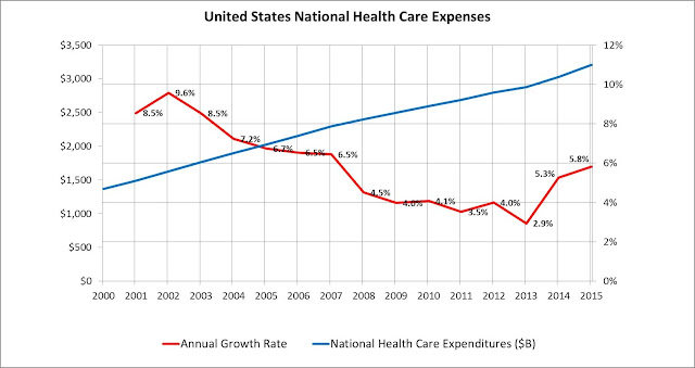
Health care prices in the United States continue to rise faster than the overall economy, as seen in figure 10 below, placing a greater burden on the United States economy.  The annual growth rate in health care expenditures have come down significantly in the past fifteen years, from an average growth rate of 8.1% per year from 2001 – 2005, 5.1% in the period from 2006 – 2010, and 4.3% annual growth from 2011 – 2015.  The implementation of the AVA has recently increased health expenditures, albeit growth rates that remain half of what they were fifteen years ago. 

Figure 10 – National Health Care Expenditures

Health care expenditures place a burden on the economy, constraining growth.  As such, health care costs are an important factor to watch going forward. 

L.  Federal Funds Rate

An important factor that impacts the level of economic activity is the Federal Funds Rate.  For nearly a decade, the Federal Funds Rate has been kept close to zero, which has been extremely beneficial to the economy.   Historically, the Federal Funds Rate appears to be a good indicator for predicting recessions, as the feds typically tighten rates as the economy heats up.  Currently, the Feds have just started tightening interest rates.  It is highly likely that this tightening will continue over the next few years, creating a headwind for the economy.    

Figure 11 – Federal Funds Rate

M.  Tell-Tale Recession Indicator Shows Economic Downturn Not Imminent

The difference between long term and short terms interest rates is a very good recession indicator, which is illustrated in Figure 12 below.  It can be observed on the chart that the spread is trending towards an economic slowdown, although it could be several years before it gets there.   

Figure 12 – 10-yr Treasurer Rate minus 2-yr Treasury Rate

Interest rates are a critical factor in understanding the status and strength of the economy, and we are likely not to see a downturn in economic activity unless and until we see the spread between long term and short term interest rates collapse.  It would appear that this index, once it falls below zero, predates a downturn by about eighteen months as illustrated in the last five downturns.


Given the current weakness in the economy, it does not appear that negative spreads will be realized in at least the next two years, and that a downturn therefore is not likely until at least the latter half of 2019 at the earliest. 

Thursday, April 23, 2015

Tesla Prospects: Bumpy Road Ahead

Tesla sales in the first 10 months of 2014 were down 16% on a year over year basis compared to 2013.


Everyone  is running around talking about how solar PV has hit grid parity in multiple states and countries.  Interesting parable - solar - in that solar PV has been around a long time and costs have been coming down significantly for many many years. I worked in a solar PV company back in 1979 and 1981, designing and building irrigation and remote power solutions.

Right now, for solar to be cost effective, even after all of this insane cost reduction, it still needs a 55% subsidy to stand on its own two feet here in Massachusetts. The is a federal incentive of 30%, and a state incentive of another 25% or so (based on variable SREC pricing). Even with these subsidies, it is a hard sell. Certainly much easier with $0.80/watt panels.

Point being is that electrochemical batteries have been around a long long time, and cost improvements have come slowly. We all want to see a sea change in the cost/performance of batteries, and let's support and cheer on the innovators pouring their time and resources into bringing about a better future. I get concerned about the mounting hype cycle and the damage that unrealized expectations may bring.

So, why isn't Elon Musk introducing an electric vehicle that can go 200 miles at the $50,000 or $60,000? Price? Some have postulated that the Tesla Model 3 will actually be priced closer to $60,000 when it is introduced. The introduction date has been publicly stipulated to be 2016, then perhaps 2017.

Based on the 2 year delay with the Model X, it is likely that the Model 3 won't be available to purchase until 2019, as a prototype has not yet …

Assume a more efficient, lighter smaller car than the model S, and a 200 mile range as compared to the Model S 285 mile range. Battery capacity may need to be 50 kWh, and the cost will have to be $200/kWh, compared to $352/kWh on the Model S, a 43% reduction in battery cost. Will we see a 43% reduction in battery cost in the next 5 years? Nope. Will it be close? Yup.

Will people want to buy a car with 200 mile range? It is not going to be a a mainstream product with that kind of range. Five years from now, the ICE and hybrid designs are going to continue to be more efficient, and more difficult to compete against. Battery cars 5 years from now are going to be an important part of the transportation system, but with inferior performance, they will occupy a "big niche" in the market, but will not be mainstream. Ultra hybrids, however, will benefit from the lowering of battery costs and ICE improvements, and will occupy an increasing position in the market.

The economic picture of the United States consumer is not going to change a whole lot in the next five years, sadly. Cars are going to continue to be a smaller share of the transportation pie, with many more options being available, from bike friendly cities, expanded Uber/Lyft, Zip cars, bike sharing, expanded transit, moving to cities, etc. Life choices are already changing, as both of my children in their twenties do not have cars, although the once did.

Most people have limited budgets and will not be able to afford the cost and hassle of having a vehicle with a lower utility value. Given the choice between spending less for a car that can go 450 miles, or spending more for a car that can go 200 miles, the choice for many is what can be called a no brainer, no matter how environmentally just an electric vehicle option may be.

Friday, April 10, 2015

WSJ: Google Gets Into Battery Arms Race


Source: http://www.wsj.com/articles/google-gets-into-battery-arms-race-1428694613

Google Gets Into Battery Arms Race

Research team working on projects to improve lithium-ion and solid-state batteries

For a wearable device like Google Glass, improved batteries could help power energy-intensive features like video.ENLARGE
For a wearable device like Google Glass, improved batteries could help power energy-intensive features like video. PHOTO: AGENCE FRANCE-PRESSE/GETTY IMAGES
Google Inc. has joined the search for better batteries to power its expansion into consumer electronics and other hardware.
In late 2012, a team led by former Apple Inc. battery expert Dr. Ramesh Bhardwaj began testing batteries developed by others for use in Google devices. About a year later, the group expanded to look at battery technologies that Google might develop itself, according to people familiar with the matter.
The group, part of the Google X research lab, is small, with just four members. A Google spokeswoman declined to comment or to make Dr. Bhardwaj available.
Google in recent years has moved into industries such as transportation, health care, robotics and communications, designing physical devices that require efficient batteries. Chief ExecutiveLarry Page told analysts in 2013 that battery life for mobile devices is a “huge issue” with “real potential to invent new and better experiences.”
Dr. Bhardwaj has told industry executives that Google has at least 20 battery-dependent projects. The company’s latest self-driving car runs on batteries recharged by electricity. The first version of Google’s Glass Internet-connected eyewear suffered from short battery life, which the company hopes to improve. An effort to use nanoparticles to diagnose diseases relies on a small battery-powered monitoring device.
Scientists at Stanford say they’ve created an aluminum-ion battery that solves many of the problems with lithium-ion and alkaline batteries. Is this a miracle breakthrough? WSJ’s Jason Bellini has #TheShortAnswer.
Google joins many technology companies trying to improve batteries, including Apple,Tesla Motors Inc. andInternational Business Machines Corp. These efforts have so far produced only incremental gains, a contrast for tech companies accustomed to regular, dramatic leaps in the efficiency of semiconductors.“Google wants to control more of their own destiny in various places along the hardware supply chain,” said Lior Susan, head of hardware strategy at venture-capital firm Formation 8. “Their moves into drones, cars and other hardware all require better batteries.”
Emerging battery technologies promise bigger gains. Solid-state, thin-film batteries transmit a current across a solid, rather than liquid, making them smaller and safer. Such batteries can be produced in thin, flexible layers, useful for small mobile devices. But it isn’t clear whether they can be mass produced cheaply, said Venkat Srinivasan, a researcher at Lawrence Berkeley National Lab.
At Google, Dr. Bhardwaj’s group is trying to advance current lithium-ion technology and the cutting-edge solid-state batteries for consumer devices, such as Glass and Google’s glucose-measuring contact lens, according to the people familiar with the matter.
In a February presentation to an industry conference, Dr. Bhardwaj described how solid-state, thin-film batteries could be used in smartphones and other mobile devices that are thinner, bendable, wearable and even implantable in the human body.
For a wearable device like Glass, he said, the batteries could help power energy-intensive features like video. For the contact lens, the technology is safer because it doesn’t use flammable electrolyte liquid, Dr. Bhardwaj’s presentation explained.
Other teams at Google are working with Chicago-based AllCell Technologies LLC on more potent batteries for four hardware projects, including Project Loon, the company’s effort to beam Internet signals from high-altitude balloons, people familiar with the matter said.
A Project Loon video from late 2013 shows Google engineers bundling AllCell batteries into the system’s power pack. Lithium-ion batteries perform poorly in the subfreezing temperatures of the stratosphere, where Loon balloons float. AllCell wraps lithium-ion batteries in a wax and graphite material that quickly absorbs heat and spreads it evenly, extending their life. Google is experimenting with specially formulated materials for better cold-temperature performance, Jim Morash, a Project Loon engineer said in the video.
—Rolfe Winkler contributed to this article.

Thursday, March 5, 2015

Energy Storage Deployments by Technology

Energy Storage is dominated by pumped hydro.


Sunday, January 25, 2015

Impact of High Solar Adoption on Utility Economics

Impact of high solar market adoption by residential customers on utility economics is illustrated in the infographic below. As solar adoption increases, fixed transmission and distribution costs are spread over fewer kWh sales, increasing electric rates. As electric rates increase, solar payback gets lower and lower, further accelerating the adoption of solar, distributed generation and efficiency.


Friday, December 19, 2014

Jevon's Paradox

In 1866, Stanley Jevons wrote about the seemingly contradictory determination that increased efficiency results in increased consumption: "It is wholly a confusion of ideas to suppose that the economical use of fuel is equivalent to a diminished consumption. The very contrary is the truth. As a rule, new modes of economy will lead to an increase of consumption." 

It is now referred to as Jevon's Paradox. A copy of Stanley's book can be accessed here:  Jevon's Paradox

Sunday, December 7, 2014

Innovation Powering Up India


1.5 Billion People in the World do not have Electricity
India is Deploying Renewable MicroGrids to Close the Gap
December 7, 2014

Author: 
Donald S. Bradshaw, Jr., President, Velerity


An innovative hybrid solar-biomass DG power plant in India is bringing electricity for the first time to villages in the Indian state of Bihar.  Another innovative design, a biomass gasifier running on rice husks, has been deployed in 85 locations across Bihar.  According to an International Energy Agency study, approximately 579.1 million people do not have access to electricity in India. [1]  According to a study published by the Vasudha Institute in India, “…close to 100,000 villages remain un-electrified, with over 45% of the population having no access to electricity.” [2]  Based on the results of the 2011 Census, out of 246.7 households in India, 32.8% of households, or 80.9 million households, did not have access to electric light. [3]

There is a strong link, both empirically and statistically, between access to energy and economic well-being, as seen in the following chart.  According to a recent report, Rural Electrification in India, having access to reliable electricity “…represents a key driver behind economic development and raising basic standards of living.” [4]  On average, increasing per capita GDP by $10 requires approximately a 93,000 Btu increase in primary energy consumption.  In the data below, Indian primary energy use is 20 million Btu per person per year, and per capita GDP is $1,055 per year. [5]


Electrification in India brings significant benefits to agrarian economies, increasing irrigation and crop production.  It has also been shown that bringing electrifying households can reduce a household’s expenditures, when switching from kerosene lighting to electric lighting. 

One of the States in India with the lowest penetration of electricity for household lighting is Bihar, with only 16.4% of its households reporting electric lighting in the 2011 Census.  This corresponds to 15.8 million households in Bihar which do not have electricity, out of a total of 18.9 million households. 

Being connected to the grid, however, does not guarantee having access to electricity.  Once a village in India has connected to the grid, generation capacity in India is inadequate to meet demand.  There are four main reasons why supply does not meet demand.  The first is inadequate installed supply.  Economic growth in India in recent years has outstripped the ability to add additional power plants.  The government of India estimates in 2014 that there is a daily shortage of capacity in the country of 30,000 MW.  This results in power rationing through planned outages. [6]  A second major factor is breakdowns and maintenance schedules of existing power plants, forcing plants to be off line even though power is required.  The third reason is the lack of available capacity in the distribution and transmission lines to transport the power.  The fourth reason is the lack of revenues due to subsidization, customers not making payments, and the stealing of power.

According to the World Bank, “In India electricity theft leads to annual losses estimated at US$4.5 billion, about 1.5 percent of GDP.[7]   According to the World Bank, annual losses by the power sector are expected to reach $27 billion per year by 2017.  Between 2007 and 2012, India installed 50 GW of new generation capacity, which fell short of the original goal of 78 GW.    

Planned outages typically occur during times of peak demand, which is in the evening hours.  Outages can last from 2 to 20 hours per day. 

There are many solutions being implemented to address India’s power situation.  For villages that have no power, solutions include:


In the Indian state of Bihar, several innovative approaches are being taken, and I would like to illustrate two of them.  The first is an innovative 3 MW hybrid solar/biomass power system in Barun in the State of Bihar.  The system is utilizing a hybrid design, combining a linear parabolic trough solution, known as CSP (concentrating solar power) with a biomass plant.  The purpose of hybridizing the solar with the biomass plant is to be able to integrate some degree of dispatchability into the operation of the plant. 

The plant has been given the designation SCOPE BIG, which stands for Scalable CSP Optimized Power Plant Engineered with Biomass Integrated Gasification.  It is designed to be demonstration project for which additional larger scale deployments will follow. 

Participants in the project include Indian-based CSTEP (Center for the Study of Science Technology and Policy, Thermax, the Bihar State Power Generation Company, Energy Centre of the Netherlands, and the National Centre for Scientific Research, based in France.  Fraunhofer Germany is also participating. 

Another innovative approach being taken to address energy and poverty issues in Bihar is Husk Power Systems, which has deployed approximately 85 off-grid biomass gasification plants in India with agreements in place to deploy additional systems on the African continent.  In 2012-2013, India produced an estimated record crop of rice, amounting to 104.4 million tonnes. [8]  As a by-product of rice production, this means that India also produced an estimated 25.1 million tonnes of rice husks. [9]  For the most part it has been determined that these rice husks are disposed of in landfills. 

After evaluating several alternative approaches, the founder of Husk Power Systems,Gyanesh Pandey, developed a gasification system that utilizes waste rice hulls as feed stock.  The system is comprised of a rice husk gasifier, a series of filters to clean up the gas, a gas engine, a 35 kW generator, and a 240 Volt Alternating Current system to connect customers within a two kilometer distance from the plant.  Within several months of an installation, the company usually has a 75% market penetration rate.  The average number of customers per system is between 200 to 250 households and additional commercial customers.  Each residential customer receives two 15 watt compact fluorescent light bulbs and a phone charger.  Each customer pays about $2.20 per month for the service, which reduces their Kerosene use by about 6 to 7 litres per months, with a net saving per household of an estimated $4.40 per month.  Customers can have increased levels of service, if desired. [10]  The system needs about 110 pounds of corn husks per hour to operate at full output. 

There are many innovations that have been deployed to drive costs down and make the system successful.  One of the interesting outcomes is that the bulk of the payments that customers make for their electricity is recycled back into the local economies, for labor and biomass.  More information can be found on their web site:  http://www.huskpowersystems.com/  


[1] Rural Electrification in India – an overview, Bilolikar & Deshmukh, National Power Training Institute, Faridabad
[2] An Endless Wait with an Uncertain Future: Unpacking the Energy Crisis,
[4] Economic and Institutional aspects of Renewables, James Cust, Anoop Singh and Karsten Neuhoff, December 2007
[5] Sustainable Economics, Donald Bradshaw, Book Draft, December, 2014
[6] India faces a daily power outage of 30,000 MW, Livemint, August 11, 2014
[7] Reforming the Power Sector, Public Policy for the Private Sector, Note Number 272, World Bank, September 2004
[8] Pocket Book on Agricultural Statistics 2013, Government of India, Ministry of Agriculture, December, 2013
[9] Agriculture Fuels Renewable Energy in India’s Rice Belt through Husk Power Systems, Feed the Future, Newsletter, November 22, 2013
[10] Husk Power Systems India, Case Study Summary, Ashden Awards Case Study, 2011 Ashden Award, April 2011